Analyzing and Visualizing a Model
The results of a hypatia model
When a model is solved, the results will be postprocessed and uploaded to the interface in the format of a nested Python dictionary. The results dictionary classifies the outputs of the model in the following hierarchy:
- Variable Level
- Region Level
- Technology Type Level
Values as pandas DataFrames
For example, for a model that is solved, user can have access to variable production_by_tech for the Supply technologies in region1 as follow:
model.results['production_by_tech']['region1']['Supply']
Visualization
Note
Hypatia visualization module is under active development.
Hypatia supports a couple visualization routines.
To use the plot functions, you need to set up the configuration of the plots like the colors or names through a multi-sheet excel file. As before, you can create the raw excel file by the model in the proper structure and fill it accordingly:
model.create_config_file(
  path = 'path/to/directory/config.xlsx'
)
This function will create an excel file with the following structure:
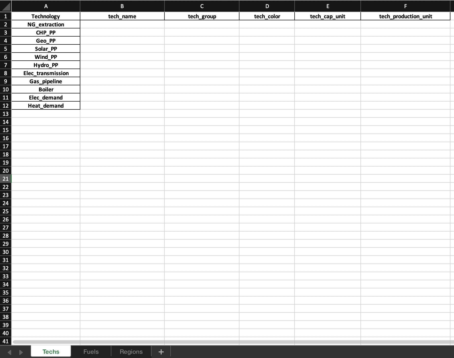
In order to have meaningful plots, it is necessary fill the tech_group and fuel_group in the correct way. For example, you may consider all the power plants as a single tech_group or different type of electricity flows (to final user, intermediate, and …) as a single fuel_group. Once the config file is ready, you can create an instance of the Plotter object. Besides the config file, you need to specify if the model has an hourly resolution or not.
from hypatia import Plotter

plots = Plotter(
  results = model,
  config = 'path/to/directory/config.xlsx',
  hourly_resolution = True, # if model has an hourly resultion otherwise False
)